spuriouscorrelations 0.2 is now on CRAN, showcasing intriguing correlations while offering tools for visualizing and analyzing datasets effectively.
With the recent release of spuriouscorrelations version 0.2 on CRAN, the R community receives an exciting tool to explore amusing and often misleading correlations. This package aims to preserve the fascinating examples first popularized by Tyler Vigen. Following the website’s downtime as of October 9, 2023, the datasets have been retained using snapshots from the Internet Wayback Machine, ensuring the continuance of this playful data exploration.
Installation Instructions
To dive into spuriouscorrelations, users can easily install the stable release from CRAN with this command:
install.packages("spuriouscorrelations")
For those looking to experiment with the latest development version, it’s just a bit more effort away. You can install it straight from GitHub with:
remotes::install_github("pachadotdev/spuriouscorrelations")
It's important to emphasize that installations from GitHub may have unfinished features or bugs, but they often provide fresh functionality that advanced users might want to explore. The trade-off between stability and access to new features is something you’ll want to consider.
Visualizing Spurious Correlations
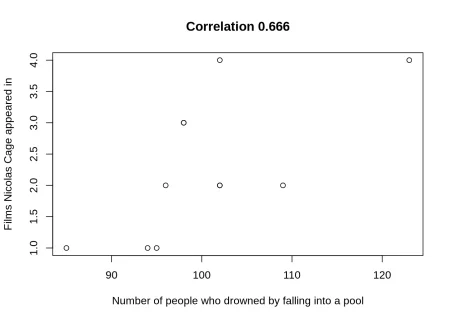
The package serves as a fun tool for visualizing a variety of spurious correlations. For instance, let’s zoom in on a classic case involving two seemingly unrelated variables:
- x: Number of people who drowned by falling into a pool
- y: Number of films featuring Nicolas Cage
By using the package, we can quickly calculate the correlation coefficient between these two variables:
cor(pool_drownings$x, pool_drownings$y)
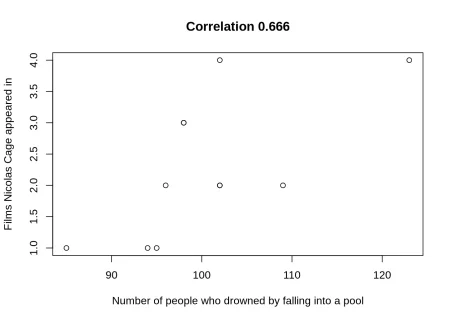
The correlation coefficient here hovers around 0.666—an eyebrow-raising figure, to say the least. This apparent relationship, while striking, is entirely coincidental. It serves as a reminder of how data can be manipulated to suggest false narratives. The lesson? Correlation does not imply causation.
To visualize this connection, you can generate a chart as follows:
tinyplot(
y ~ x,
data = pool_drownings,
main = sprintf("Correlation %s", round(cor(pool_drownings$x, pool_drownings$y), 3)),
xlab = "Number of people who drowned by falling into a pool",
ylab = "Films Nicolas Cage appeared in"
)
Data Structuring for Enhanced Visualization
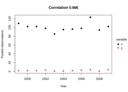
To refine your visualizations and make the relationship between the two variables clearer over time, transforming the dataset into a long format can be beneficial. This structure highlights how these spurious correlations exist across different years:
pool_drownings_2 <- reshape(
pool_drownings,
varying = c("x", "y"),
v.names = "value",
timevar = "variable",
times = c("x", "y"),
direction = "long"
)
This reshaped dataset promotes effective plotting, revealing insights into the data's progression over the years. For example, when you plot the data, you can observe variations that might otherwise be overlooked.
tinyplot(
value ~ year | variable,
data = pool_drownings_2,
main = sprintf("Correlation %s", round(cor(pool_drownings$x, pool_drownings$y), 3)),
xlab = "Year",
ylab = "Pooled observations",
pch = 19
)
Standardizing Variables for Clarity
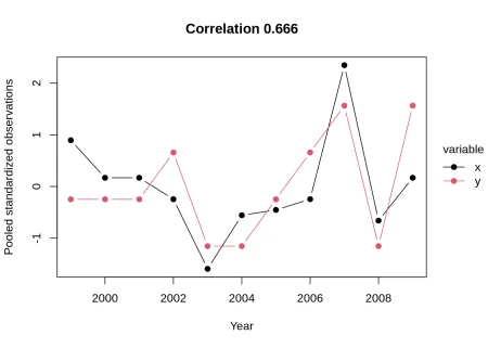
Standardizing your variables is another essential step toward clarity in visualization. This process addresses visibility issues that arise from using different scales:
pool_drownings_3 <- pool_drownings
pool_drownings_3$x <- (pool_drownings_3$x - mean(pool_drownings_3$x)) / sd(pool_drownings_3$x)
pool_drownings_3$y <- (pool_drownings_3$y - mean(pool_drownings_3$y)) / sd(pool_drownings_3$y)
pool_drownings_3 <- reshape(
pool_drownings_3,
varying = c("x", "y"),
v.names = "value",
timevar = "variable",
times = c("x", "y"),
direction = "long"
)
This standardization yields a visual representation that allows for more straightforward comparisons between the two variables:
tinyplot(
value ~ year | variable,
data = pool_drownings_3,
main = sprintf("Correlation %s", round(cor(pool_drownings$x, pool_drownings$y), 3)),
xlab = "Year",
ylab = "Pooled standardized observations",
pch = 19,
type = "b"
)
Future Implications and Significance
While a package like spuriouscorrelations might seem light-hearted, its implications are serious. It unlocks a deeper understanding of how data can mislead, fostering critical thinking in data interpretation. In an age where information—and misinformation—is abundant, the ability to discern genuine insights from coincidental correlations is increasingly valuable. This isn't merely a pastime; it's a necessary skill.
If you're working in this space—whether data science, analytics, or just someone fascinated by statistics—it’s paramount to integrate this type of analysis into your repertoire. Understanding that data can often tell two opposing stories opens your eyes to potential biases in reporting and personal assessments alike.
(And this is the part most people overlook) The entertainment value of the tool cannot overshadow its educational potential. As users engage with these playful correlations, they’re also learning vital lessons about statistical literacy that extend far beyond the interface of this package. In an era where big data often seems daunting, tools like these make the exploration much more inviting, and, ultimately, beneficial.
R-bloggers.com offers daily e-mail updates about R news and tutorials about learning R and many other topics.
Discussion
Sign in to join the discussion.