Explore how to create dynamic opposing column animations using CSS for a captivating user experience on larger displays.
Design choices often start out feeling quirky, but they can evolve into something captivating. This was the case for me with my latest project: crafting columns of elements that scroll in opposite directions as users navigate the page.
Important: To experience this effect, ensure your motion settings are configured to allow animations. So far, my observations are based on support in Chrome and Safari.
You might be surprised at how achievable this is! Utilizing current CSS capabilities, particularly scroll-driven animations, makes it straightforward. And let's face it, the process is quite enjoyable! I’ll walk you through my method, and I’m eager to hear your thoughts on how you might tackle this differently.
The HTML Structure
At the core of this design is a straightforward HTML structure. We need a parent container (.opposing-columns) housing children elements (.opposing-column), which in turn contain the individual items (.opposing-item):
<div class="opposing-columns">
  <!-- Column 1 -->
  <div class="opposing-column">
    <div class="opposing-item">...</div>
    <div class="opposing-item">...</div>
    <div class="opposing-item">...</div>
  </div>
  <!-- Column 2 -->
  <div class="opposing-column">
    <div class="opposing-item">...</div>
    <div class="opposing-item">...</div>
    <div class="opposing-item">...</div>
  </div>
  <!-- Column 3 -->
  <div class="opposing-column">
    <div class="opposing-item">...</div>
    <div class="opposing-item">...</div>
    <div class="opposing-item">...</div>
  </div>
</div>
This foundation is all we need in markup; CSS will handle everything else!
Styling the Main Container
To start, we’ll ensure that this effect is only available on larger displays. Trying to implement this on smaller screens doesn’t make sense, as we need that extra width for the design to work effectively.
/* Targeting larger screens */
@media screen and (width >= 50rem) {
  .opposing-columns {
    display: flex;
    gap: 2rem;
    max-inline-size: min(90dvi, 50rem);
    margin-inline: auto;
  }
}
Implementing the "Masking" Effect
To create the illusion that items in each .opposing-column are vanishing as they approach the edges of the parent container, we’ll need to adjust a few properties. Elements in the outer columns will ascend while the center column descends, creating a fading effect as they exit.
To achieve this, we’ll start by setting a background color variable across the document:
@media screen and (width >= 50rem) {
  :root {
    --opposing-bg: lightcyan;
    background-color: var(--opposing-bg);
  }

  .opposing-columns {
    /* previous styles */
  }
}
Next, we’ll apply this background on the container’s pseudo-elements (:before and :after):
@media screen and (width >= 50rem) {
  :root {
    --opposing-bg: lightcyan;
    background-color: var(--opposing-bg);
  }

  .opposing-columns {
    /* previous styles */

    &:before,
    &:after {
      content: "";
      position: absolute;
      inset-inline: 0;
      block-size: calc(var(--opposing-mask) * 3);
      pointer-events: none;
      z-index: 1;
    }
  }
}
By placing these pseudo-elements at a higher stacking level, we can effectively mask the elements in each column as they move in and out of visibility. This setup allows the items to flow under these pseudo masks.
To facilitate this, let’s define an additional variable, --opposing-mask, to create some vertical separation between the parent container and the columns:
@media screen and (width >= 50rem) {
  :root {
    --opposing-bg: lightcyan;
    --opposing-mask: 3rem;
    background-color: var(--opposing-bg);
  }

  .opposing-columns {
    display: flex;
    gap: 2rem;
    max-inline-size: min(90dvi, 50rem);
    margin-inline: auto;
    margin-block: var(--opposing-mask, 3rem);
    position: relative;
  }
}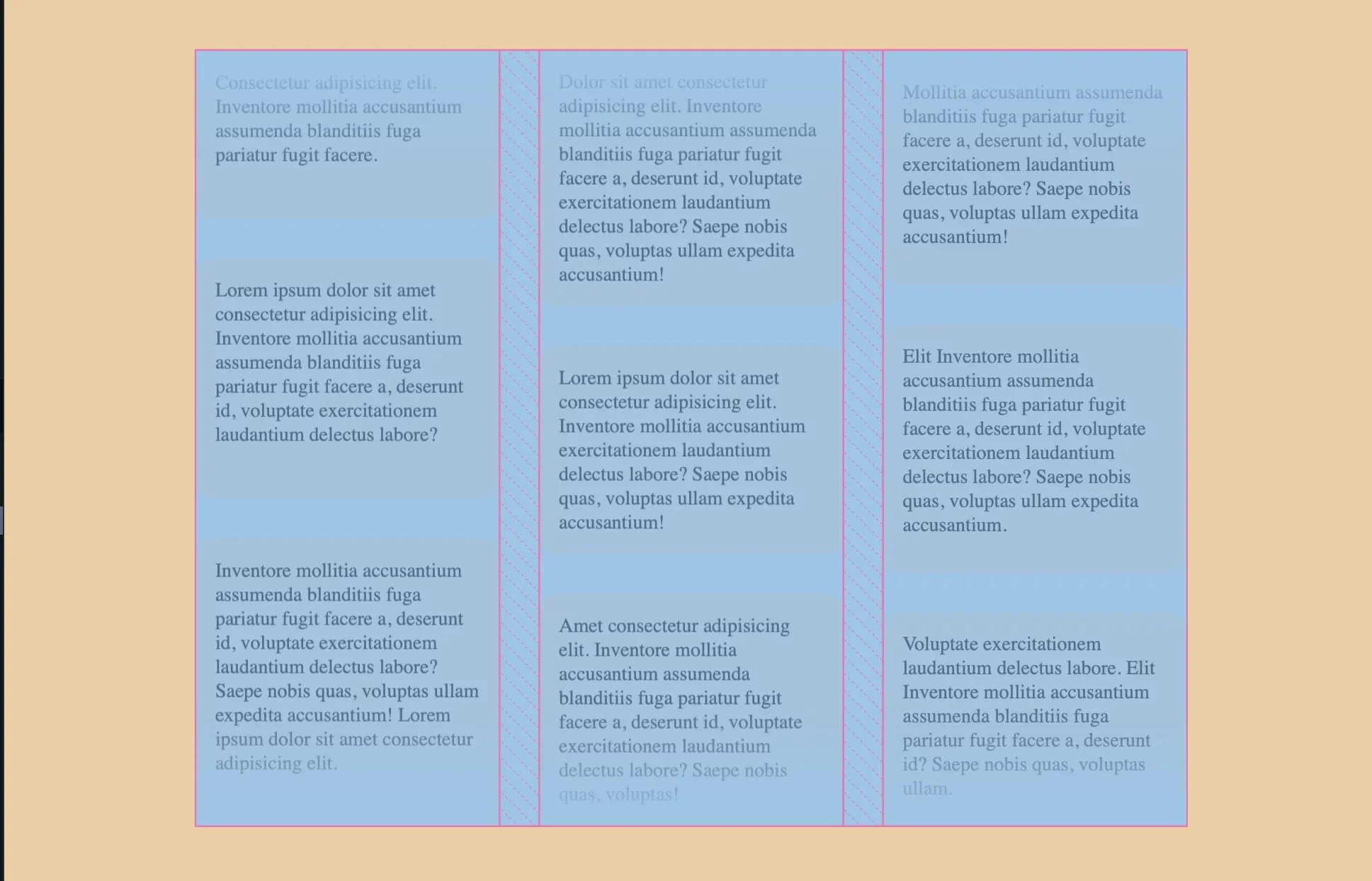
Applying the same variable to the pseudo-elements ensures that there’s adequate distance between them and the parent. This separation is critical for achieving the desired visual effect of fading as items scroll out of the container.
@media screen and (width >= 50rem) {
  :root {
    --opposing-bg: lightcyan;
    --opposing-mask: 3rem;
    background-color: var(--opposing-bg);
  }

  .opposing-columns {
    /* previous styles */

    &:before,
    &:after {
      content: "";
      position: absolute;
      inset-inline: 0;
      block-size: calc(var(--opposing-mask) * 3);
      pointer-events: none;
      z-index: 1;
    }
  }
}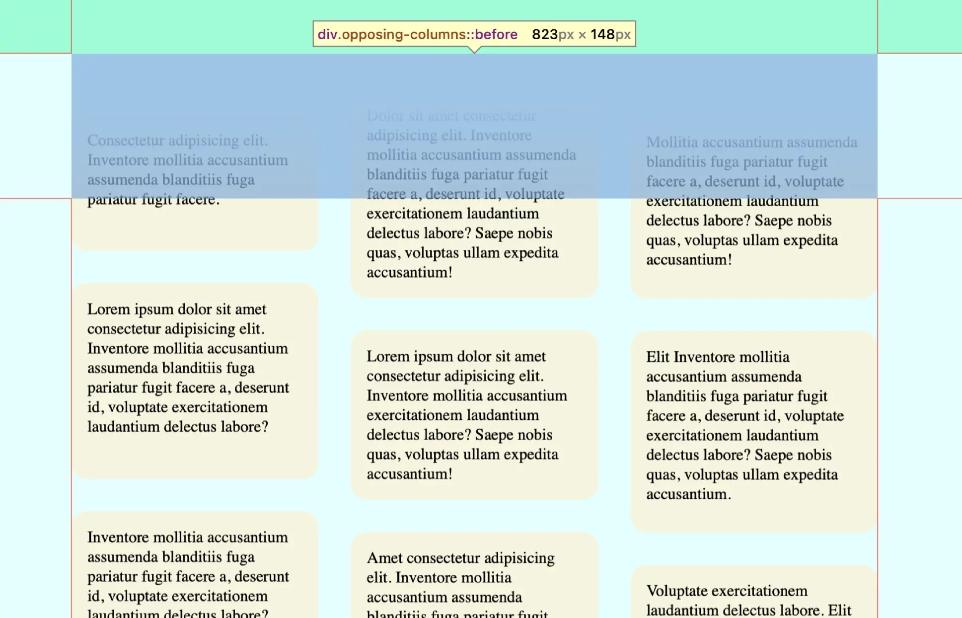
You’re probably starting to see how this all ties together. The intentional spacing between the container and its pseudo-elements is designed to create a fading effect as items exit the view. We don’t need to fiddle with opacity—we can simply add gradient backgrounds to these pseudo-elements.
For the :before pseudo, we’ll use a gradient that transitions from the background color to transparent, flowing from top to bottom. In contrast, the :after pseudo will feature the reverse gradient, transitioning from transparent to the matching background color from bottom to top.
@media screen and (width >= 50rem) {
  :root {
    /* previous styles */
  }

  .opposing-columns {
      /* previous styles */

      &:before,
      &:after {
        /* previous styles */
      }

      &:before {
        background-image: linear-gradient(
          to bottom,
          var(--opposing-bg) var(--opposing-mask),
          transparent
        );
        inset-block-start: calc(var(--opposing-mask) * -1);
      }

      &:after {
        background-image: linear-gradient(
          to top,
          var(--opposing-bg) var(--opposing-mask),
          transparent
        );
        inset-block-end: calc(var(--opposing-mask) * -1);
      }
    }
  }
}
Setting Up Column Layouts
Before we dive into the scrolling magic, we need to properly position the items within each column. Each column acts as a flex item within the parent container, which functions as a flexbox. They'll shrink and grow as necessary, but we'll cap the size using flex-basis: 10rem.
Here’s how we’ll capture that using the flex shorthand:
@media screen and (width >= 50rem) {
  /* previous styles */

  .opposing-column {
    flex: 1 1 10rem;
  }
}
Next, we’ll set the columns as grid containers to take advantage of the gap property for spacing between items:
@media screen and (width >= 50rem) {
  /* previous styles */

  .opposing-column {
    flex: 1 1 10rem;
    display: grid;
    gap: 2rem;
  }
}
While Flexbox could have achieved similar results here, opting for grid simplifies the layout since the default is set to row, which would have required an override to column.
The Animations
Now we reach the exciting part: orchestrating the animations! With the groundwork laid, it's time to enable the columns to move fluidly in and out of the parent container as the user scrolls.
For this, we'll make use of the animation-timeline property. Normally, animations are set to trigger based on time alone. With the animation-timeline, however, we can synchronize the animation with scroll position, thus creating a “scroll-driven” effect.
There are two relevant functions here: scroll() and view(). While both deal with scroll mechanics, scroll() focuses on an element's scroll position, whereas view() tracks its visibility as it enters and exits a defined scrollable area.
Given our setup, view() is the ideal choice, allowing us to dictate when the animation kicks in as items scroll into view and when it halts as they exit.
What’s fascinating here is the precision we achieve with view(). We can define the exact start and stop points of the animation relative to the scrollable area:
/* Syntax */
animation-timeline: view([ <axis> || <'view-timeline-inset'>]?);
Let's set up the axes:
@media screen and (width >= 50rem) {
  /* previous styles */

  .opposing-column {
    /* ... */
    animation-timeline: view();
    animation-range: entry cover;
  }
}
This indicates that we want the animation to (1) initiate immediately upon entering the viewable area (entry), and (2) conclude once completely out of that area (cover). Clearly specifying insets allows us to establish the animation's range, with entry starting at 0% and cover reaching 100%.
@media screen and (width >= 50rem) {
  /* previous styles */

  .opposing-column {
    /* ... */
    animation-timeline: view();
    animation-range: entry 0% cover 100%;
  }
}
Finally, we want the animation to progress linearly. No easing in or out here; just a fluid movement:
@media screen and (width >= 50rem) {
  /* previous styles */

  .opposing-column {
    /* ... */
    animation-timing-function: linear;
    animation-timeline: view();
    animation-range: entry 0% cover 100%;
  }
}
That’s great and all, but we still need to create an animation. What we’ve set up so far deftly outlines behavior, but defining the actual motion is vital.
We'll be implementing three distinct CSS animations:
- The first will move items upward in the left column.
- The second will reverse that movement for the items in the right column.
While we could apply the first animation to both outer columns, I want a third animation that subtly offsets the movement for a staggered appearance.
@keyframes scroll1 {
  from { transform: translateY(var(--opposing-mask)); }
  to { transform: translateY(calc(var(--opposing-mask) * -1)); }
}

@keyframes scroll2 {
  from { transform: translateY(calc(var(--opposing-mask) * -1)); }
  to { transform: translateY(var(--opposing-mask)); }
}

@keyframes scroll3 {
  from { transform: translateY(calc(var(--opposing-mask) * .66)); }
  to { transform: translateY(calc(var(--opposing-mask) * -.33)); }
}
To simplify potential updates, let's create variables for these animations:
@media screen and (width >= 50rem) {
  :root {
    --opposing-bg: lightcyan;
    --opposing-mask: 3rem;
    --animation-1: scroll1;
    --animation-2: scroll2;
    --animation-3: scroll3;

    /* ... */
  }
}
Then we'll assign these animations to their respective columns:
@media screen and (width >= 50rem) {
  /* previous styles */

  .opposing-column {
    /* previous styles */
  }

  :where(.opposing-column:nth-of-type(1)) {
    animation-name: var(--animation-1);
  }

  :where(.opposing-column:nth-of-type(2)) {
    animation-name: var(--animation-2);
  }

  :where(.opposing-column:nth-of-type(3)) {
    animation-name: var(--animation-3);
  }
}
While we’re at it, let’s ensure we honor users’ settings for reduced motion. This means disabling animations and removing the pseudo-elements to avoid any strange appearances:
@media (prefers-reduced-motion: reduce) {
  .opposing-column {
    animation: unset;

    &:before,
    &:after {
      content: unset;
    }
  }
}
Final Thoughts
In conclusion, scroll-driven animations are genuinely fascinating. Although we're still waiting for Firefox support, you can easily implement this technique within an @supports query for browsers that don't support it. This way, you can provide a graceful fallback experience using traditional animations:
@supports (animation-timeline: view()) {
  /* fallback styles */
}
This introduction merely scratches the surface of what scroll-driven animations can achieve. What have you created or experimented with in this area? Or would your approach diverge from mine? Share your thoughts!
Discussion
Sign in to join the discussion.