iPadOS 27 sticks with a complex multitasking approach, but a simpler version for casual users would enhance usability and flexibility.
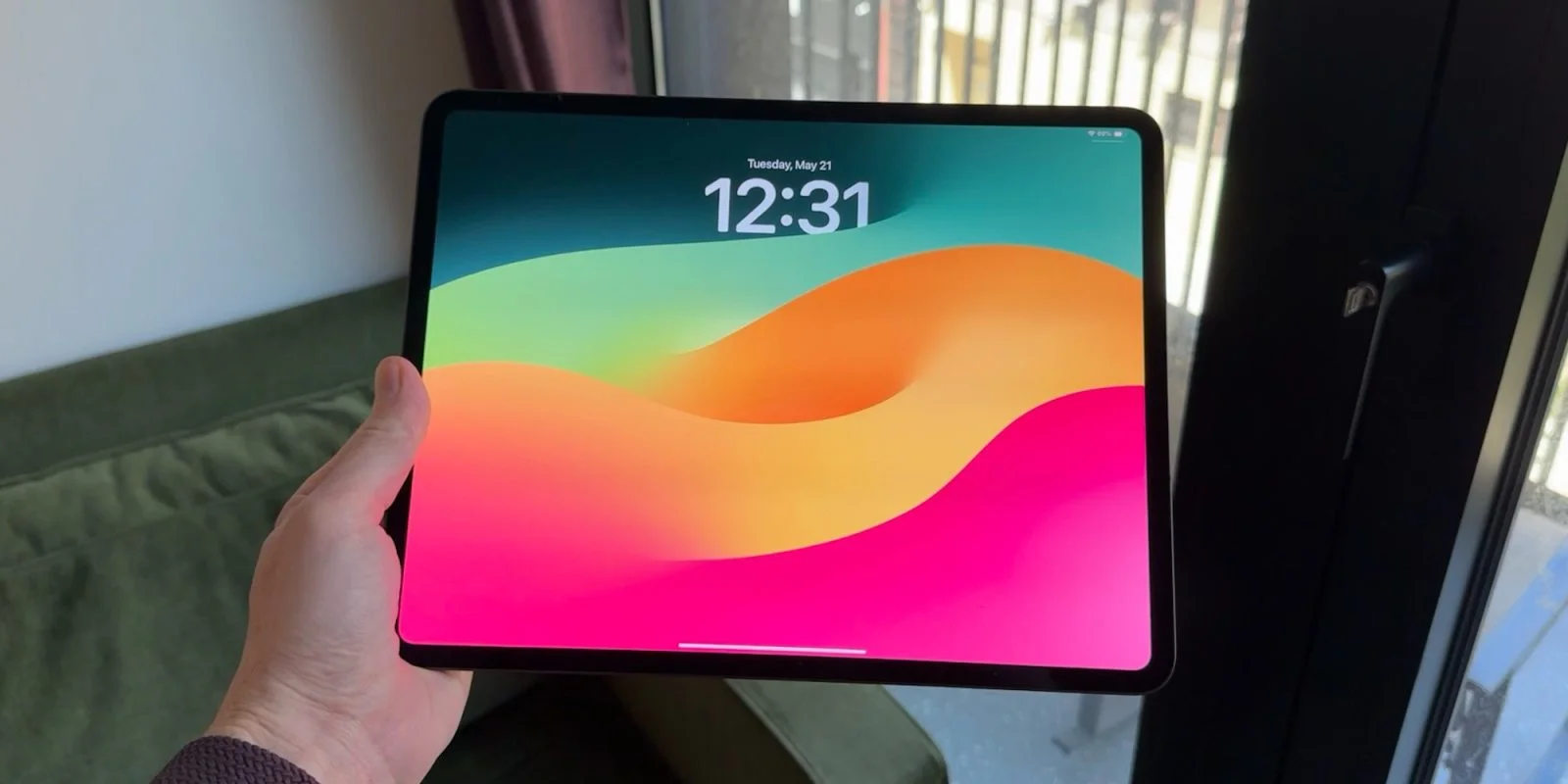
Apple's iPadOS 27 maintains the windowing system introduced in iPadOS 26, which aimed to refine multitasking. This shift initially removed simpler features like Split View and Slide Over, although those options later made a return—albeit under the constraints of the new windowing system. My expectation was for iPadOS 27 to simplify this experience, but it seems Apple has missed the mark.
The windowing feature has its strengths; for instance, when I'm juggling several apps on my 13-inch iPad Pro with the Magic Keyboard, it can be quite effective. However, this experience varies on smaller devices, and the rigid approach can be frustrating, especially when the most straightforward option is to use every app in full screen.
Rethinking Multitasking Options
While iPadOS 26 eventually reinstated Split View and Slide Over, they can only be accessed when the windowing system is activated. This setup complicates what was once a seamless multitasking experience. Users often find themselves grappling with the positioning of windows, as incorrect alignment can inadvertently trigger Split View instead of the intended layout. This lack of intuitiveness can lead to a significant drop in productivity, particularly for users accustomed to more tactile multitasking methods on other platforms. The expectation was that Apple would enhance ease of use, yet the complexity seems to have increased.
Although Apple allows users to manage these multitasking features through long presses on the window controls, this approach feels counterintuitive for everyday use. The crux of the issue is that integrating these simpler multitasking options within the more complex windowing framework adds layers of complication that diminish usability. For most users, navigating these long press options can feel like an unnecessary obstacle. This is a far cry from the intuitive gesture control that iOS originally championed, where actions were streamlined for quick access.
A Call for Distinct Multitasking Modes
A dual-system for multitasking could resolve many of these issues. Imagine having a "Classic" mode tailored for casual users and a "Pro" mode for those who prefer advanced functionalities. "Classic" would allow apps to open in full screen while retaining easy access to Split View and Slide Over. In contrast, the "Pro" mode would offer the full range of windowing capabilities alongside customizable Stage Manager features. This kind of differentiation could offer users the flexibility they crave—those who just want to use their devices for basic tasks wouldn't be bogged down by pro-level features they’ll never explore.
This distinction would cater to different user needs—essentially simplifying the experience for those who simply wish to use their iPad as it was originally intended. It’s clear that a balance is needed between advanced multitasking and straightforward usage. The pivot towards professional features could alienate a significant segment of the iPad user base that primarily seeks a device for consumption and basic productivity. Imagine a family using an iPad to stream movies or do schoolwork—their needs are simple, while those of a designer or programmer are vastly different. Finding the right mix could address both sides effectively.
Implications of iPadOS 27's Approach
The direction Apple has taken with iPadOS 27 raises significant questions about the future of the iPad as a multi-faceted device. While Apple has positioned the iPad as a laptop competitor, primarily with the introduction of keyboard and mouse support, they risk misreading their target audience. What may seem like an appealing push toward more complex functionalities could inadvertently frustrate everyday users who may not appreciate—or even understand—these advanced options. If you're working in this space, consider the dissatisfaction among average consumers. The seamless integration showed promise, but the reality suggests Apple may have overestimated users’ readiness for more complicated multitasking.
And this is the part most people overlook: simplicity is key. In a world where technology users often seek straightforward solutions, making the iPad experience less accessible might prompt existing users to explore alternatives. Apple's challenge lies not just in maintaining attention with loyal customers but in attracting new ones who might be on the fence. Given the competitive landscape filled with affordable and user-friendly tablets, the pressure is on Apple to strike that balance more sharply.
Ultimately, Apple seems to have skewed the iPad experience too much towards pro users, potentially alienating those who value simplicity. Revitalizing a simpler multitasking option could genuinely enhance the overall user experience. What are your thoughts on the multitasking capabilities of iPadOS since the introduction of this overhaul? The stakes are high for Apple, and their next move could define how the iPad fits into the future gadget set.
My favorite Apple accessory recommendations:
- Anker Ultra-Slim MagSafe Battery Pack
- AirPods Pro 3 (2x ANC vs AirPods Pro 2!)
- Anker Nano 45W Fast Charger with Smart Display
- Anker Prime 3-in-1 25W Compact MagSafe Charger
- Logitech MX Master 4 Mouse for Mac
- AirTag 2 4-pack (50% improved Precision Finding!)
- Belkin MagSafe 3-in-1 Charging Stand for iPhone
Top comment by G A B E ðª
Liked by 16 peopleI'm frustrated that Slide Over hasn't made a strong comeback. Stage Manager feels more useful with the Magic Keyboard or when connected to a monitor. I’m curious how multitasking will evolve with smartphones like the foldable iPhone.